
ReturnRunners
ReturnRunners is a Chicago-based startup that aims to help its customers save time by picking up and returning their online and local purchases for them. I was introduced to this project during my time at Designation and worked over a span of 3 weeks. ReturnRunners tasked us with redesigning their current consumer facing app and their marketing site.

Background
ReturnRunners aims to offer their customers a white-glove return service: they first match the customer with one of their employees, who they refer to as runners, then the runner picks up the items that need to be returned.
The founder Fara came to Designation initially with the hopes of building out a back-end application to serve as a platform for the runners and allow them to quickly and easily find their pickup location, chat with the customer, confirm what items are being picked up, reference the store’s return policy and map out where they need to make their returns that day. Finally, they would be able to confirm the items had been successfully returned and communicate this to the customer through the app.
Before our team started the project, a UX team at Designation worked with Fara, more specifically her employee Sammy, who is currently working as a runner for the company. Through research and user testing they created a set of wireframes that laid out a simple user flow for the runner and allowed them to be able to access all the information they needed. The UX team aimed to create a clear map for runners with simple pick-up and drop-off screens. These wireframes were our initial framework into creating the visual design for ReturnRunners.

Understanding the project
Our goals for our first meeting with Fara and her team were to get to know each other, gauge expectations, and try to figure out how they felt about their brand and its visual representation. We did a quick design exploration exercise to get them to talk about different visuals and explain if they fit the ReturnRunners brand. We gained a lot of insight from this exercise; we found out they wanted to position themselves as a mix of both a high-fashion and a high-tech logistics company. They were drawn to clean lines, traditional luxury serif fonts and an overall high-end feel.
We also asked them to complete another brand positioning exercise by sorting adjectives on how closely they aligned with their brand. This helped further confirm to us their ideals in terms of brand positioning: they wanted to be sleek, sophisticated and cutting-edge.

Design exploration and research
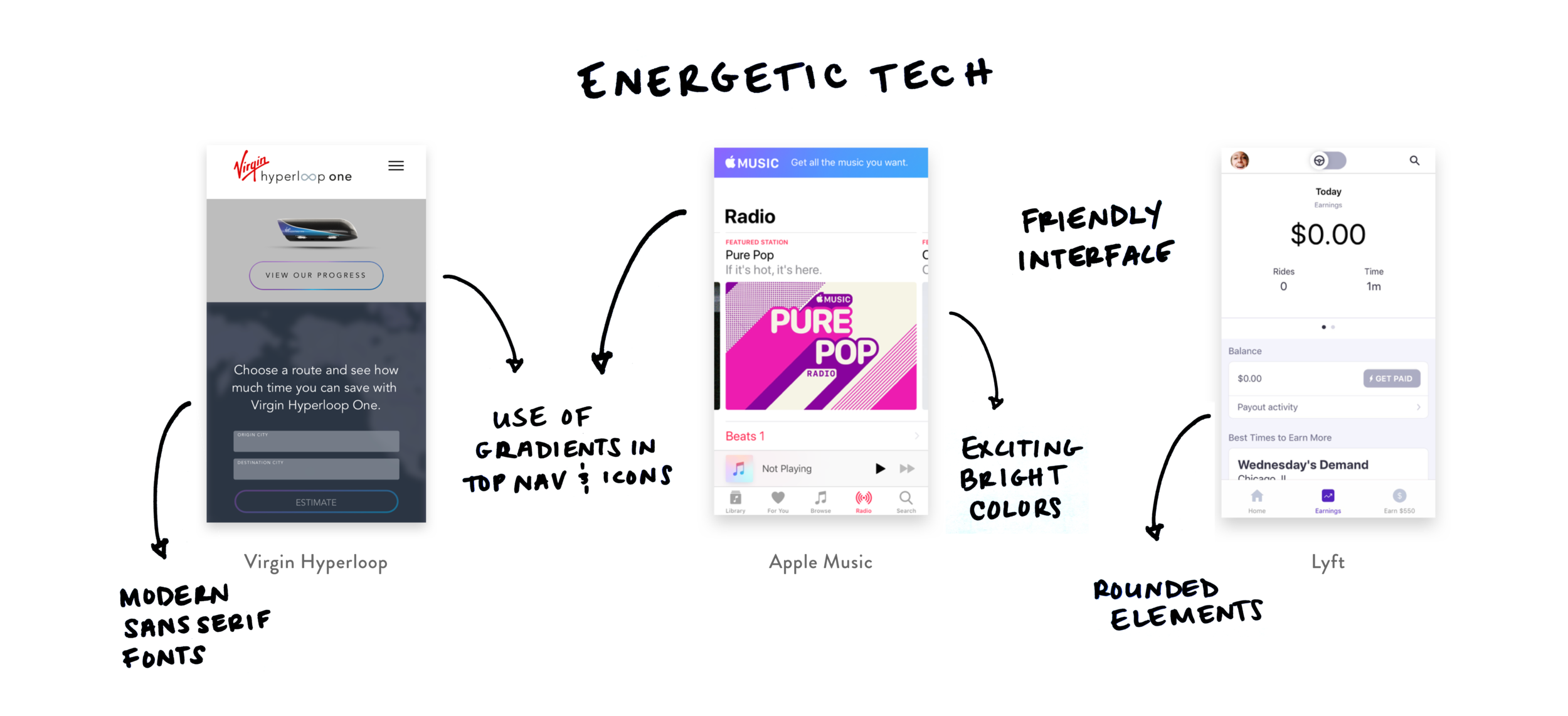
Keeping the client’s feedback in mind, we decided to do some visual competitive research. We looked at other companies positioned similarly to ReturnRunners and we branched out of typical fashion and retail sites by looking at high-end furniture, cars, restaurants, and tech.
We started to notice a lot of similarities between these websites in terms of their visual design. Most of the luxury product sites were clean and minimal with only black, white and grey color palettes using sharp edges and clean thin lines.

Conversely, high-tech sites like Hyperloop, Lyft and Apple Music were more refreshing and gave off a more energetic vibe. They used brighter colors, gradients, and rounded elements that came across as modern and fresh.
Design principles
I started to think of a way I could combine these 2 directions into something that felt modern and high-tech but still embodied the traditional luxury look and feel Fara was looking for. We started to see connections between ReturnRunners’ design goals and competitors’. This helped us analyze the insights we got from them and create principles to help guide our designs.
Fara also expressed wanting us to redesign the consumer-facing app as well, so we took into account elements of runners’ and consumers’ needs from the design.

Initial design ideation
After doing some inspiration research and defining our design principles I was then able to dive into creating individual design explorations. I wanted all three to be unique but still speak to the brand values of ReturnRunners.

1st style tile → I wanted to create an interpretation of a fashion editorial. To remain elegant and grounded, I went with a neutral color palette, using mostly black and white and a lighter clay/rust color. I made elements slightly rounded so they kept the sense of formality Fara was looking for but didn’t look severe. I also used a more rounded serif font to balance the high-end look with approachability.

2nd style tile → In this style exploration I was inspired by modern high-fashion brands, more specifically Balenciaga. I wanted this exploration to feel futuristic and cutting-edge—my interpretation of the intersection of high-tech and high-fashion. I used clean sharp edges to make the design feel clean and modern and I kept the color palette just black and white a bright red accent to add an engaging and bold element that enticed new users.

3rd style tile → I wanted this design to feel modern but more friendly. I used cooler colors to appeal to a more universal audience. I also made the elements slightly more rounded and approachable while still using a lot of white space to balance high-end and approachability. Overall, this style leaned more towards the look and feel of a new tech app than an explicit fashion inspiration. I wanted this design to feel more familiar and reliable rather than cool and exclusive.
After presenting these to the ReturnRunners team I got a lot of useful feedback on how to move forward. They liked the first tile, its font and how clean it was but said it felt a little feminine. They liked the second tile the most, saying it had a luxury feel and felt futuristic. They loved how it combined the idea of modern tech and high fashion. The third style exploration was their least favorite. They liked the design but said the blue made it feel masculine and too calming—not the look they were going for.
After taking into account Fara and her team’s feedback I decided to move forward with the second concept. They felt it best aligned with their brand and lent itself the best to what they wanted to accomplish.
Desirability testing
In the initial scope of the project we were asked to design the runner side of the app, so we created initial designs and concepts for this. Then in our second meeting the client mentioned she asked us to also rethink the current customer-facing application. This caused us to start by creating 3 screens for the customer side and 2 for the runners side for testing.
We had different goals for testing the two sides:

Runner-side goals
We focused more on functionality. The app needed to be glance-able, even on the move, as runners travel to several locations per day. It needed to maintain their overall brand look and feel.
Customer-side goals
We wanted to use existing familiar app patterns so users could quickly and easily navigate through the flow. This ease of use was important as users don’t have a lot of time and want this app to make their lives easier. It also needed to feel exclusive and premium as this was the brand positioning of ReturnRunners. Lastly, we wanted to focus on the user’s emotional connection and communicating a level of trust when using the app.
We tested with five users for desirability testing. Our testers had heard of ReturnRunners before but none of them had actually used the app. Also, none of them were runners or planned on being runners, so it was difficult to explain the runner’s perspective and having to switch back and forth during testing. Overall my designs resonated with users but there were some opportunities as well:
Opportunities
Users liked images but thought they might skew feminine.
The map screen was clear but it lacked some information that could be considered necessary or more clear (like what the times meant and detail of drop off vs. pick up).
Successes
Users thought the images felt on-brand and high-end.
They liked the red color, saying it was easy to identify the CTA buttons.
Users felt the overall design was clean and minimal, and they liked the font choices saying they felt modern and inviting.
The bright red color highlighted important information and made it glanceable for the runner. Also by keeping the overall design clean black and white it still was high-end and chic for the user.
The screens achieved a good balance between chic and high-fashion but also fun and approachable, drawing users in and making them want to engage and use the application.
After testing I felt pretty confident I was headed in the right direction. I learned that ReturnRunners definitely positioned themselves more high-end than I originally thought and also that they weren’t targeting just a female clientele. This helped me to continue on the luxury/tech direction I was already headed but with more consideration into my choice of imagery. I also learned that while taking out information helped to streamline the look and feel of the app, I needed to add back in additional details that were useful to the user.
The pivot
After conducting our initial desirability testing with both the runner-side and consumer-side screens we quickly realized the difficulty of effectively developing both. Our users had trouble simultaneously imagining themselves as two distinct people when testing. We also realized that moving into actual usability testing, we didn’t have any testers lined up that were actually runners. Since ReturnRunners is still a small business they didn’t have a team of runners yet, so we wouldn’t be able to test any of these screens with actual users. Without this perspective, it was much harder to design the app effectively. This caused us to re-examine the feasibility of what we could realistically offer ReturnRunners in such a short time frame and what was most beneficial to them at this stage in their business. Ultimately, we decided as a team to focus on improving their current customer-facing app and redesigning their current website to be cohesive. We also kept the runner-side app in mind with our overall design choices so this could still be built out later.
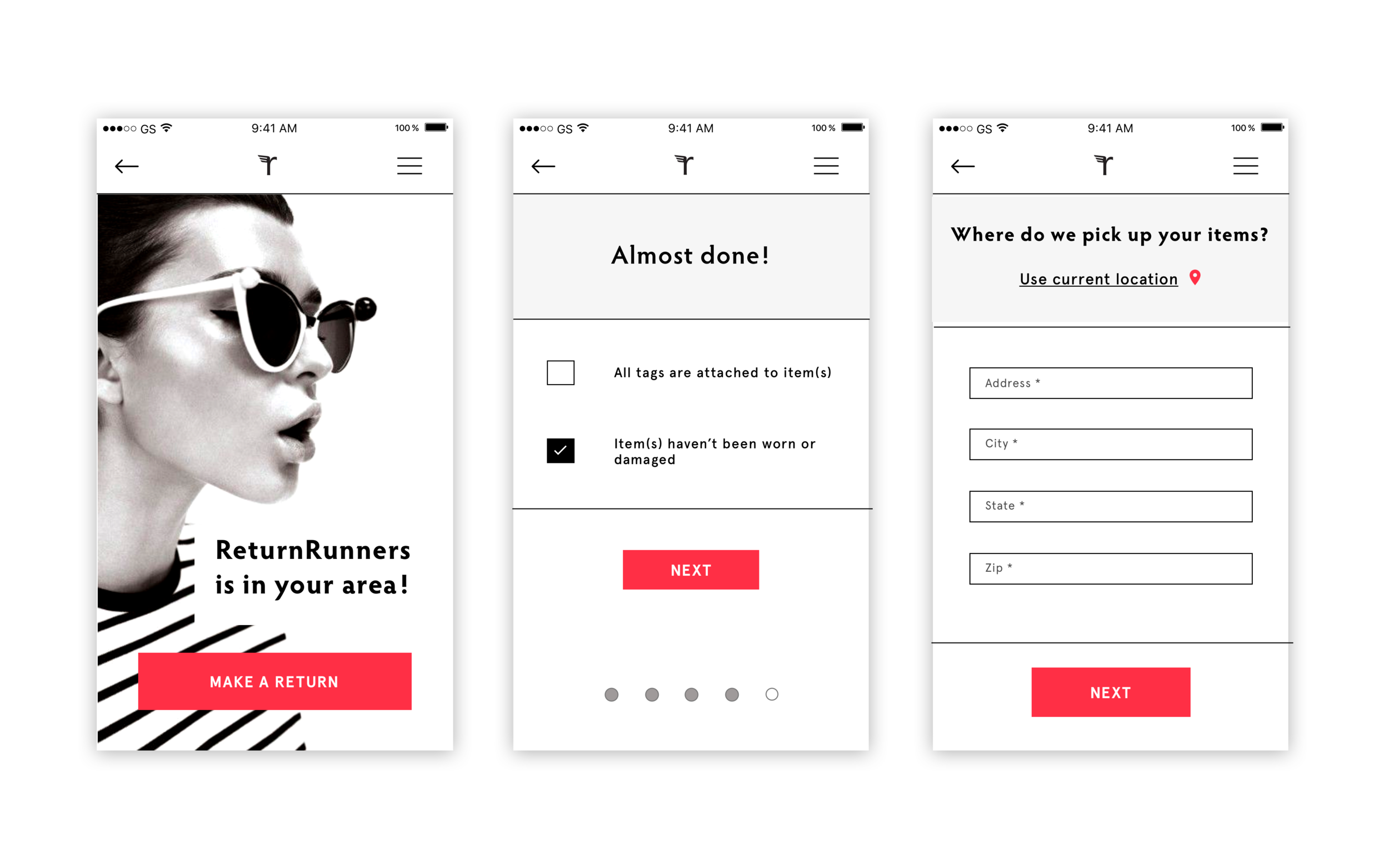
Since we didn’t have wireframes for the consumer site, we used their current screens as a guide (see below). The current app screens were not well branded and while they were simple they lacked visual hierarchy and had many unnecessary steps in the flow.

We had a meeting with the team to discuss the new focus and where they saw the future of their app and brand going. Also, what additional screens they would build out in a perfect world. This helped us understand what was feasible in terms of development and what we could realistically leverage to simplify the flow and make things more seamless for the user.
Incorporating a receipt reader → This is a feature in the app where a customer can take a picture of their receipt and then from that picture the information would pull from that receipt. Then users can choose items they wanted to return and are able to see all the information at once.
Ability to be able to upload multiple receipts at once → Currently in their flow the user is only able to take a picture of one receipt at a time, but then must go back through the entire flow again if they want to return items from another receipt.
Adding the return reasons → This step wasn’t featured in their current flow but Fara wanted to add this as a value prop for her business. ReturnRunners could use this information and be able to provide more detailed data to the stores they partner with on the reasons behind why the returns.
In discussing these future considerations it helped me gain perspective on how I could better streamline their current flow by leveraging technology and combining several steps in the process. I had already created several screens for the runner’s side and I realized they could help serve as a guide, especially in solving some of the complex receipt screens on the consumer’s side. I already had some initial insight from the work I had already done, I just needed to further tailor this to the consumer’s side, using some of the simplification techniques I had already used in creating the runners side.
Creating a solution
While the pivot narrowed our focus and allowed us to create a more comprehensive solution for one side of the app, it was difficult to have to change our focus so late in the game and having only to go off their current app design and not fully researched wireframes. Ultimately though this was a great exercise in IA and UX considerations and allowed me to stretch my ability to create something with these practices in mind.


Usability testing
In taking into account our new focus I was able to iterate on the existing screens I had and create a new flow for the customer only. I created a marketing site for testing as well so I could see if users felt the two were cohesive and if they evoked the right response I was looking for. We were able to test with 5 users. They were all were familiar with the business but only 2 had used the app before. I created a clickable prototype using InVision so I could accurately test if my design was intuitive, easy to use, and if the overall design was on brand with ReturnRunners.
Takeaways on mobile screens:
Testers loved the red color for CTAs, they were glanceable and it was clear what to do.
The overall design was minimal and chic.
They liked the font choices they were modern and on brand.
Testers felt it may need more information and branding for partnering stores.
They liked the image choices but needed more gender neutral images to appeal to a broader audience.
Takeaways on marketing site:
The design tested well, users said it felt high-end and luxury.
They liked the layout and said it was fun and engaging.
The only changes I would make would be swapping out some of the pictures again to appear to a broader audience.
Testers enjoyed the overall design direction, it really hit the mark in terms of being on-brand and overall look and feel. They thought it still felt high-end but not entirely unapproachable because the red kept it engaging. To keep the overall design more inclusive though, I needed to adjust some of my imagery. Also to appeal to brands and perhaps business partnerships I needed to take into account more branding as far as adding logos and I needed to add more information on the individual receipts so users could better identify items they needed to return in case of them returning multiple items with the same name and different sizes.
Also, in my final design I incorporated a redesign of the ReturnRunners logo. I wanted to modernize it and to make it more cohesive with the rest of the design.
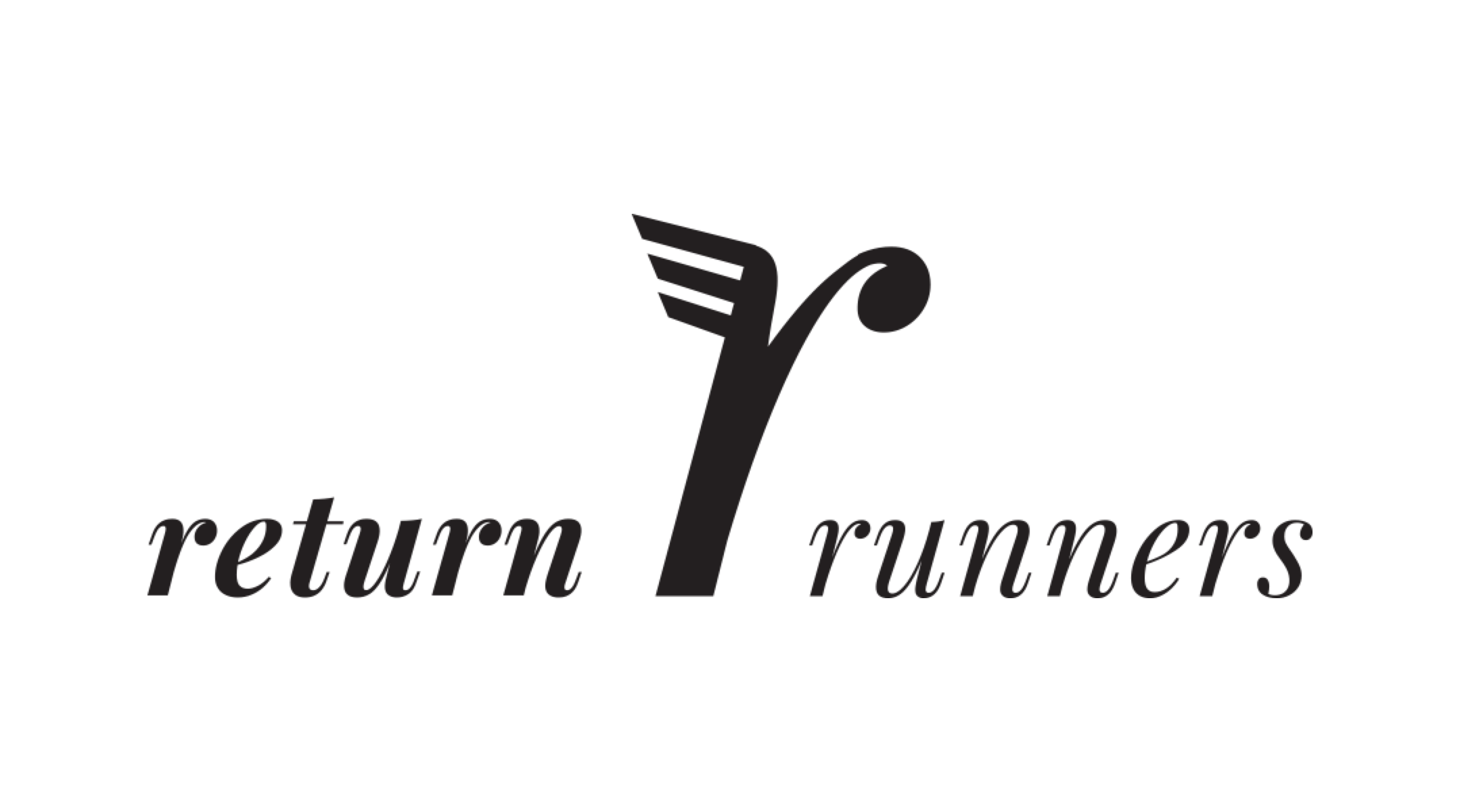
Current logo

New logo redesign
Reworking our design principles
After conducting testing it definitely gave us a new perspective on the project as a whole and what’s important to users. Also, with the new scope of the project in mind we knew as a team we had to rethink our design principles. Before we were taking into account the needs of both the runner and the consumer and now in only taking into account the consumer we had gained some valuable insight we thought should guide our design process. We came up with these new principles:

The main takeaway from these was the idea of inclusion. While ReturnRunners wants to position themselves as a high-end luxury service it still needs to be inclusive and relatable as everyone needs to make returns. Many users during testing commented on the fact that the imagery was either too feminine, too cool, too white, or too affluent. This opened our eyes to the impact imagery has to an overall design and how important it is to the user.
In keeping in mind these revised design principles I iterated on my designs taking into account the specific callouts from the user testing. In our final presentation to the ReturnRunners team I showed them the final designs and the changes that were made. They were pleased with the final results and were impressed by all of our divergent design concepts.

For the final version I wanted to make sure the splash screens were more inclusive and spoke to a wider audience. I also wanted to add more white space to the check-out screen as it felt tight. With all the information I had to include I still wanted the flow to feel glanceable and clean. I was also able to combine several screens like immediately opening the camera for either taking a picture or uploading the receipt as well as combined the scheduling of the date and time on the same screen. This helped solve Fara’s issue of having too many steps in the flow and allows save customers to save even more time.
Desktop site
In designing the marketing site I had different challenges as I had to carry through my concept and scale it to desktop size. I still needed to include all the necessary information but organize it in a more concise and interesting way to help draw new users in. The site needed to be engaging but still feel clean, chic and innovative. The testimonials are currently being shown in a automated flashing carousel which is overwhelming and distracting. I simplified this by getting rid of all the colored borders and only displaying one of the testimonials. Also, instead of automatically flashing through the users are able to click through the testimonials one by one. I also simplified the copy in each one of the sections, making it more glanceable and easier to digest.

Current site design

New site design
Style guide
In handing off my final designs I created a style guide for future designers or developers to follow so the design direction will be maintained long after the handoff. I included my re-design of their logo, and its specific usage. I also outlined the visual system I used when incorporating the brand logos. That way when new stores partner with ReturnRunners and their logo is needed, they will be cohesive.

Future considerations
In wrapping up our project with ReturnRunners we also had some future takeaways. In being only a 3-week project there were only so many features and concepts we could tackle in a short amount of time so we wanted to leave them with considerations that we would love to develop more if we had more time.
Removing the return reasons. The flow was already 7 steps and getting rid of this would save a lot of time and hassle for the customer. Also, two of the users complained that they hate having to give a reason when they make a return.
The receipt scanner technology. In further developing the design of the user flow it would be pertinent to know exactly how it worked and exactly what information could be pulled. We made our best guess and compared the theoretical functionality to current receipt reader apps on the market now but going forward it would be essential to know what solution is feasible for them from a budget/development standpoint.
An initial on-boarding for new users. This would ultimately save them at least 4 steps in the flow just by being able to login and then save their information instead of having to re-enter it every time they use the app.
All these recommendations will help cut time for users. By saving the user time, it will decrease user abandonment and increase the amount of repeat users. This will ultimately improve ReturnRunners’ business by improving the user experience overall and increasing the amount of referrals from happy customers. By implementing the receipt scanner it will also help the runners and Fara as well by automatically pulling out information, saving them time as they currently do this part manually. Also, an initial on-boarding can help create rapport with the user increasing their familiarity with the app and at the same time saving them time in the end by saving all of their information to be used later.
Improvements
There are also things I would have done differently in the design process given more time.
More testing when we pivoted to only consumer side. It would have been beneficial do do more initial user interviews when we knew we were doing only the consumer side of the app. We really could only go off of the information we had from Fara and the current app screens. With new insights and starting the design from scratch we could have developed a more innovative solution.
Build out the initial on-boarding for new users. This would have been helpful to build out and test with users to see if it was useful, what information was needed, and if it was necessary.